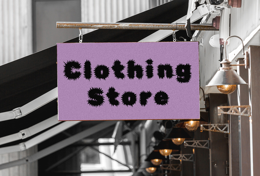
In the context of branding, fonts choices are paramount. Would you honestly ever visit any restaurant if they chose to use Rubik Beastly or Hanalei for their main font choice? Probably not.
Rubik Beastly
Hanalei
Someone who has never thought about fonts likely doesn’t understand why it’s such an important matter in branding. Even outside of branding a font choice can really affect an audience. If you want a prime example, just ask the internet what happened when Avatar originally chose to use Papyrus for their movie title font. TLDR: Some people were furious.
So how does one know which fonts they should use for their marketing collateral? Which fonts are going to drive higher conversion rates? It’s really is subjective, and partly instinctual with a hint of psychology. Different fonts bring out different emotions in people. Just think of how a halloween font looks. You’re probably thinking of a wiggly-looking font spelling out the word “spooky.” That style is connected to a certain feeling inside of you. We want to choose fonts that speak to emotions.
Each business speaks to its’ own variety of customers. Some businesses are geared to target a very niche market. The audience is tight and specific. Other businesses target a very broad audience which requires their fonts to be more “accessible.”
For example:
| Niche audiences | Broad audiences |
|---|---|
| Skateboarders | Dental services |
| Nail Salons | Amusement parks |
| Power lifting | Beach goers |
| Yoga enthusiasts | Cat lovers |
| Skydiving | Health care |
When you want to speak to a certain group of people you need to speak with a visual style that resonates with that audience.
Let’s take nail salons from the list above, for example. If you picture a nail salon in your mind’s eye you might imagine a sleek, stylish, curvy font. That would be appropriate; even though it’s best to avoid cursive fonts in branding. Why though? Think about how often you see men walking into a nail salon to get their nails done. That just doesn’t really happen. Nail salons are more likely to produce an audience of something like social women between the ages of 18 and 35.
If we want to create a nail salon brand that resonates with those ladies it’s probably best that we use that sleek, stylish, curvy font. It would look rather strange to use a large, blocky, square-like font that exudes a sense of bold, heavy, masculinity. On the contrary, you’d likely be pretty successful if you use a large, blocky, square-like font for a brand that sells power tools. Just take a look at MAC TOOLS:

You should also know that shape also plays a role in that example, but we can talk about that later. The point is that the font you choose plays a key role in the way your brand makes your customers feel. Your customers want to feel like your brand is speaking to them. Your font is like your brand’s tone of voice.
It’s the same reason why playful fonts are often used to speak to children’s games and toys. It’s why you see square, cybernetic fonts used for gamers and tech geeks. It’s why you see spooky fonts on Halloween and bubbly fonts on Valentine’s day.
When you’re planning to create your brand it’s so important that you clearly identify who you’re addressing. Who is it that you are trying to connect with? This is typically referred to as your “target audience” and you need to be crystal clear on it. Knowing who your target audience is can dramatically bloat your margins. When you speak to your audience with the right tone of voice you will be more likely to earn their trust and attention. Remember, it’s your font choice that sets the tone.
If you’re unsure of which fonts to use then it’s best you leave that part to your creative design team. More often than not a brand will need more than one font. Usually brands will utilize two fonts that compliment each other. Some brands might use three. A graphic designer (or any creative design specialist) would be well-suited to seek out harmonious fonts for your brand. Creative designers will know which fonts will speak to your audience to elicit strong response rates.