After rebranding The Met Coffee House’s logo, I had to use that new logo to create a k-cup coffee box design. To begin I needed to know which flavors where offered to customers. I went directly to The Met’s website to get that information. I copied the text description for each flavor that was listed on The Met’s website.
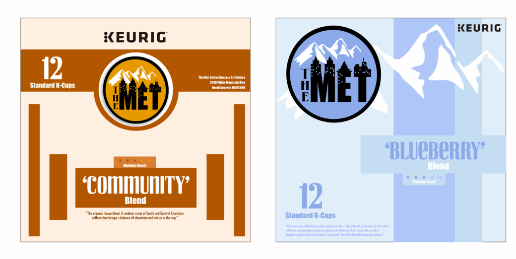
I discovered 2 different flavors that I wanted to create designs for. The “community blend” and the “blueberry blend” flavors felt like the best options to me. I started off by drafting the main face of the box for each flavor. This would help me determine which flavor I’d like to fully flesh out. It would also help me to start thinking about how I wanted to organize the information on the main face of the box.

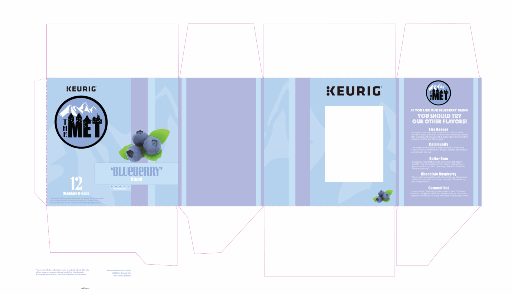
Once we had a little class review about our designs, the instructor, other students, and myself all agreed that the blueberry blend was the better option. We each received a copy of a dieline template file that our instructor supplied. I began to throw my design together as soon as I got the dieline.

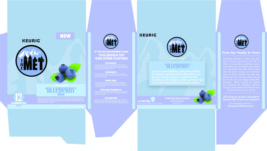
After I got the faces in place I started to arrange all the elements a little better. I decided to feature some of the other flavors offered at The Met Coffee House. I figured I would also follow the theme of the website by sharing a little about the owners.

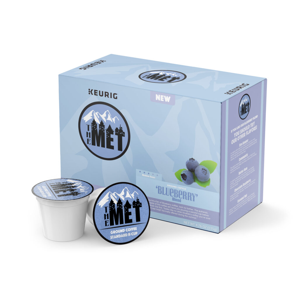
Once the dieline design was finished our instructor gave us a pre-made 3D mockup template to use with the dieline (bless her soul). The new template would allow us to map the dieline onto the final K-Cup coffee box mockup template.

