When I was attending college we received this cool assignment. The students in my class were each assigned a coffee shop to redesign. The businesses were literally hand picked by the teacher from coffee shops that exist in the real world. The instructor went down the list of student names, one by one, while reaching into a container that held the names of each business. When my name was called, the instructor reached into the container and pulled out “The Met.”
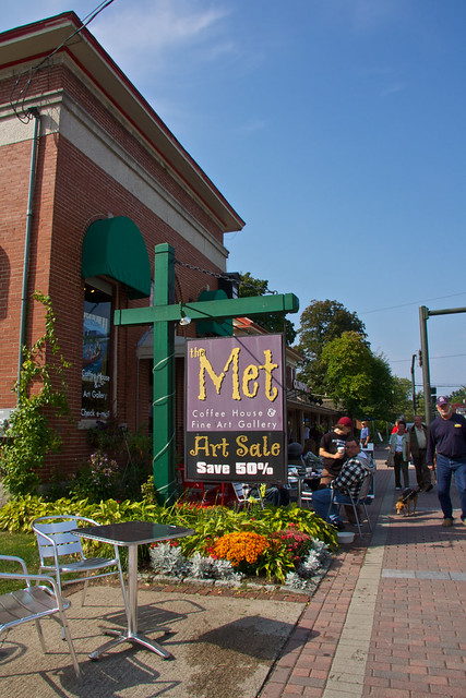
When I heard that name I thought “what even is that??” I came to find that it was a pretty popular coffee house in New Hampshire. This prompted me to perform some preliminary research so I could figure out how I was going to redesign a business with such an obscure name. When I began my research I found pictures of the logo they currently had. Here’s what I found:
As you could imagine, I was even more confused. I wasn’t sure exactly how to go about this. In order to remedy my confusion I had to create a SWOT analysis. For those who don’t know what a SWOT analysis is: It’s a method for analyzing the Strengths, Weaknesses, Opportunities, and Threats of a business. This type of analysis would allow me to form a better understanding of the business I was rebranding.
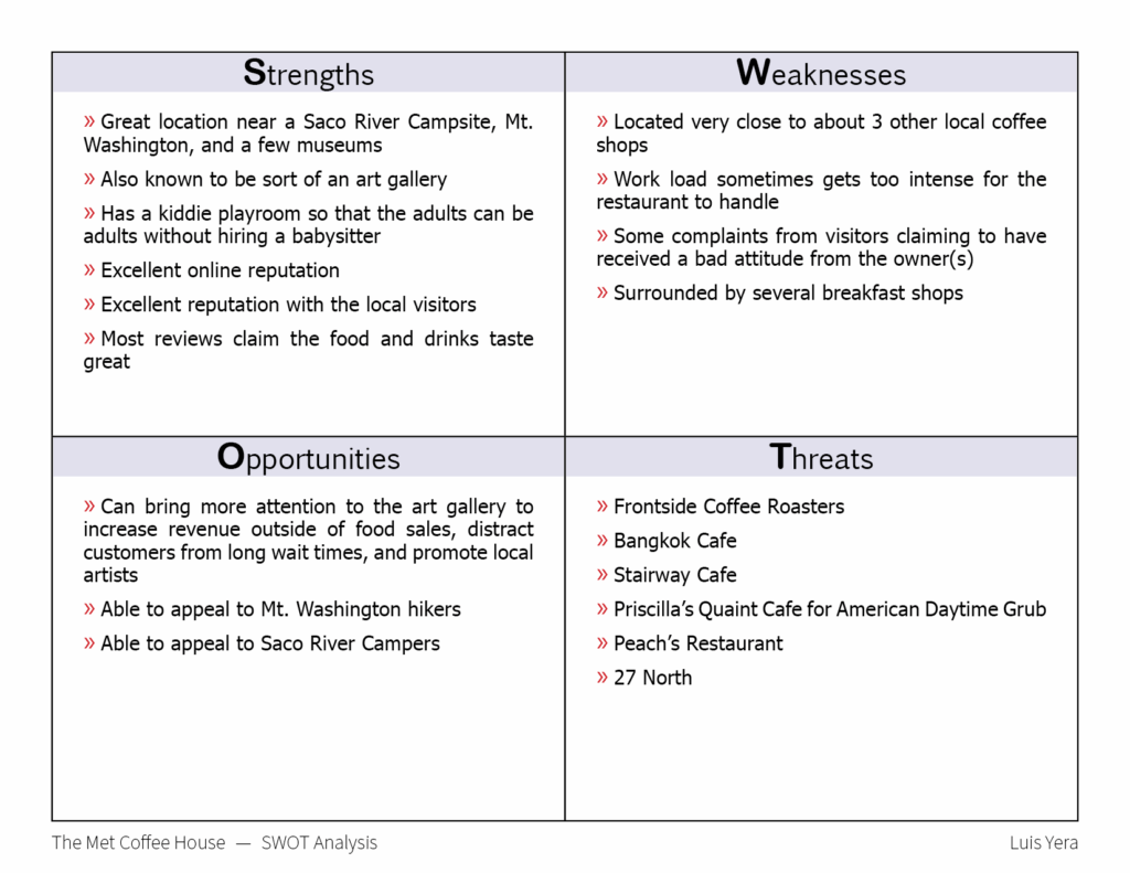
This SWOT analysis was a life saver, as it gave me a feel for the type of crowd that The Met serves on a regular basis.
This information would help me to start developing a proper brand identity based on the store’s offers, inner atmosphere, local culture, and surrounding key points of interest. I began sketching out a few different variations on a sticky note. These sketches were extremely messy, but really only created to isolate the overall idea for the type of logo that I wanted to pursue.
I decided to move forward into the blocky text instead of the rounded ones. I stepped into my design software and starting drawing out some variations to get a feel for the finished appearance.
I wasn’t much of a fan, so I investigated a little deeper into the area to see if I could develop something that would resonate more with the environment and The Met’s typical audience. I broke out of the squarish look and started to test out some circular emblems.
That was it. After receiving a little feedback from the instructor and other students, I came to the conclusion that I would use the very last variations I came up with. From there, I would test how the logo looked on a few products by creating some product mockups.
The next phase of the rebranding assignment was to use our new logos to craft a design for a K-Cup box. I’ll share the results of my final design in another post.