Let’s imagine creating a pasta brand from scratch.
If we want to make big money we need to solve big problems, right? So how in the world does pasta fit into that equation? Pasta is far too commoditized to be a big problem in need of a solution. Who can really tell the difference between pasta brands without first seeing the box they came from? You probably can’t even name a pasta brand off the top of your head right now.
The only real big solution we can create for a pasta brand is to stand out with a strong value proposition. Even if the value proposition is the best, we still won’t be able to sell much pasta unless we buckle down on very specific target audience. Finally, it’s important that we make the packaging look enticing. If we cover those 3 points, with a calculated effort, then we have a better chance at selling our pasta.
Focusing our effort on those 3 goals affords better perceived value for our pasta brand. Let’s quickly discuss why that is.
- Strong Value Proposition: Since pasta is a commodity, we need a strong value proposition to empower our pasta brand with a unique advantage. This value proposition (often also referred to as our Unique Selling Point) needs to be very attractive to the buyer. It should resonate with our target audience’s persona.
- Specific Target Audience: We need to focus our branding and marketing efforts on crafting a design that speaks directly to the demographic that we want to sell our pasta to. Studies have proven that products sell better when they resonate with a specific audience in contrast to products that are advertised to anyone and everyone.
- Enticing Packaging: If our packaging looks too dull or bland then our product will not stand out from the other pasta boxes on the shelf. Chances are that most potential buyers will overlook our pasta because the packaging looks unappealing. This could unintentionally communicate to potential customers that we don’t really care enough to put a passionate effort into our product. That matters a lot when it comes to food, because nobody wants to feed their body with low-quality foods on purpose.
So how did I go about creating a pasta brand to meet the criteria we just went over? I started by defining my target audience. It’s often a good idea to start with the target audience that you want to address. This allows us to immediately start compounding our creative energy in the proper direction right from the start. The target audience I chose to speak to were spiritual practitioners between the ages of 15 and 45. I chose this group because I was very much interested in learning about energy at that point in my life.
After defining my audience, I kept a sticky note pad near me and wrote down possible names for the brand as they came to me. I decided I would name the pasta brand “Chakra Pasta.”
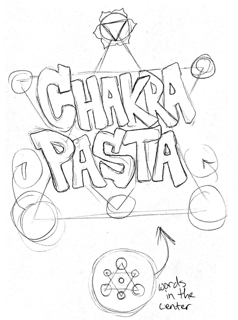
Now that I had my brand name and target audience defined I had all I needed to start forming a brand image. The best place to start a new brand image is with the brand’s logo. Every other design can branch off from the logo to create a cohesive design. After making a few really messy sketches on some notepads, I came to the idea that I would use the 7 chakra points in my logo. I wanted to use a very chunky looking font that resembled macaroni. Here’s the sketch that I ended up choosing to pursue:

I dropped my sketch into my design software and started forming the shape of the logo. I strategically chose to work with a hexagram shape because it would allow me to blend every chakra into the logo design. In the preliminary drafting phase, I just started by created a hexagon between 6 triangles. This gave me a sort of “Star of David” appeal to the logo for further spiritual reinforcement.

After getting my overall shape down, I added my “Chakra Pasta” text in the center to explore the different font options. I couldn’t really find one that resembled macaroni, so I went for something that looked close enough.
Because the center of an image is often where you place the most important elements, I chose to make the dead center of the logo the Sahasrara chakra. This is the highest chakra; better known as the crown chakra.
Once I finished arranging the colors, I cleaned up the overall shape by rounding the outer points. I placed chakras in each triangle around the central hexagon based on their traditional colors.

This would be the final logo that I decided to use for my pasta brand. The next step was to use this logo to create a pasta box design that would speak directly to my target audience. This is also the point where I would start to ask myself what the USP (Unique Selling Proposition) would be for this pasta brand. I would also need to start plotting out how I could design an enticing package design.


