After creating a logo for my Chakra Pasta pasta brand, I needed a package design. As mentioned during the creation of the logo, we still had 2 goals to meet for this pasta box design. I needed to make sure the package design featured:
- A strong value proposition
- An enticing visual appearance
In order to formulate a strong value proposition, I would need to put myself in my target audience’s shoes. I needed to figure out what’s important to them to offer a valuable USP. I declared my target audience to be spiritual practitioners between the ages of 15 and 45.
As I let the ideas roll around in my head, I wondered about meditation, mandala patterns, and healthy foods. I decided my value proposition would be an offering of better health by using clean, nutritious ingredients. Now all I needed to do was to make the design look interesting enough to capture the attention of potential buyers.
I began mapping out ideas with some sketches. I decided I would use a combination of elements between the following two designs:
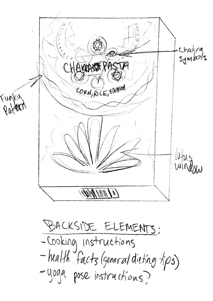
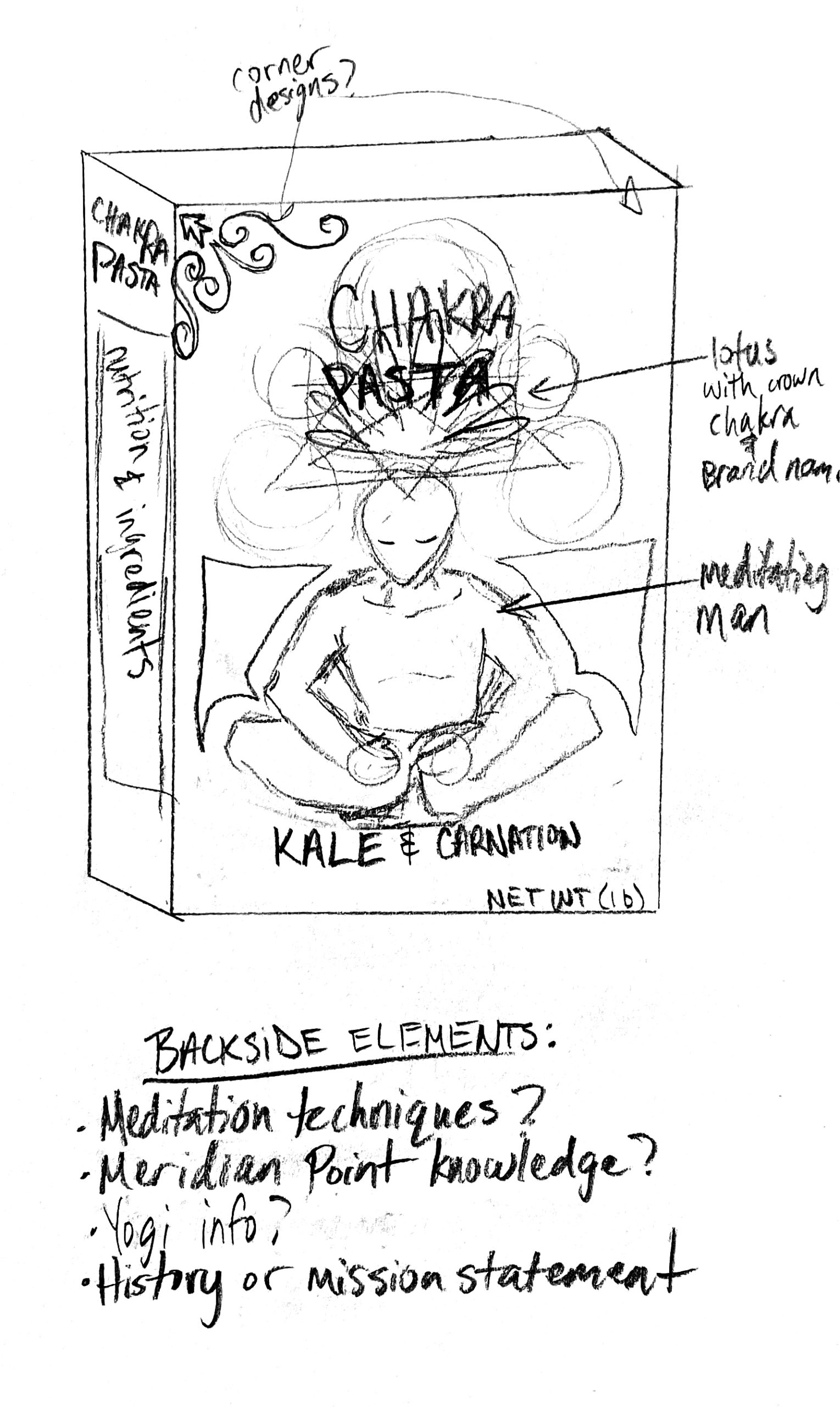
After laying out the general look and feel of the design, I was able to jump straight into Adobe Illustrator so I could start to flesh out the front face of the box’s design.
I wasn’t exactly sure which elements were necessary, so I Googled some images of pasta boxes to get a feel for some of the elements I might need to include. I needed to take a few things into consideration when designing the box. Some of the elements I needed to incorporate were:
- The type of pasta in the box
- Product weight
- Typical icons I might need to include
- Common ingredients found in pasta
- Cooking instructions
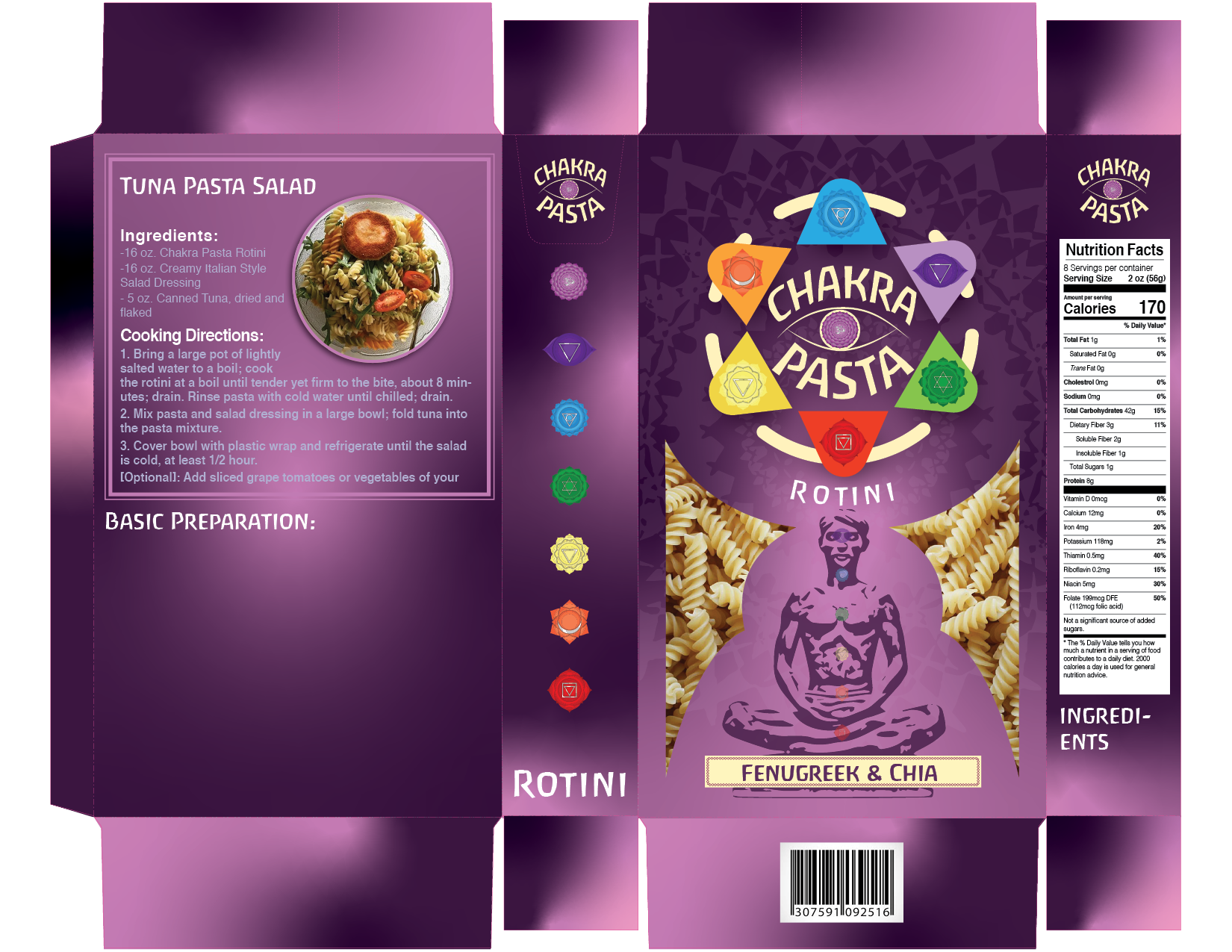
I placed the front face of the box design into a dieline. This helped me to start branching my design off to the other panels of the box from the face. I used InDesign to construct a nutrition label for one side panel. The other side panel was used for listing out each of the 7 chakras. The back panel was reserved for cooking instructions with a recipe idea.
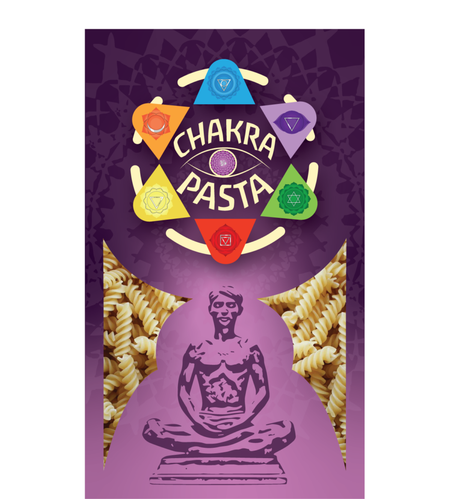
The meditating man on the front of the box would also serve as an informative visual for the consumer. It illustrates the location of each chakra throughout the body. This would also tie in neatly with the placement of the logo. Since the sahasarara (crown) chakra is believed to symbolize the higher-self (spirit), it was outside of the meditating man’s body.
The logo itself symbolizes the meditating man’s crown chakra. It is the chakra that is connected to enlightenment, spiritual connection, and divine energy; which is why it hovers above the meditating man. The subtle mandala pattern imprinted behind everything else illustrates the elegant fabric of life that emenates invisibly through the atmosphere—like a physical depiciton of life force energy. The life force energy is meant to appear as it’s pulsating from the diving source that is our universal connection through the crown chakra. All of these symbolic elements are strategically woven together to form a cohesive design that is meant to catch the interest of our target audience. If you’re wondering why the box is predominantly purple, that was also intentional. The color purple can symbolize spirituality, royalty, creativity, and magic. Pink can represent tenderness, love, and innocence. These two colors work in harmony to exude a sense of majestic benevolence. Since our target audience lives their lives seeking union with mighty, benevolent spirits this design would have a better chance to resonate with their values.
I still had some time before the project was due, so I took a step away and ignored the project for a day. This is a powerful way to make your work better. Sometimes we get too hyper-focused on our tasks and get too lost in the details; which is a great way to quickly lose sight of the bigger picture. When I returned to the project, I immediately recognized that the background gradient was far too intense. The contrast was heavily distracting. I chose to lighten the pink and blend it a little more with the purple. I then added a few more little details to finish it up.
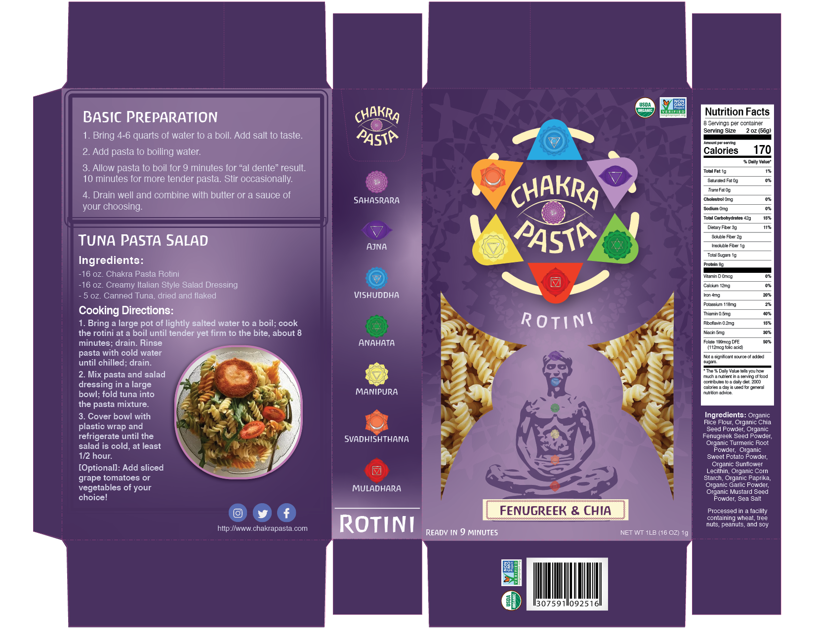
After creating the final 2D box design, I found a free pasta box mockup file online. It brings me great joy to know that I can use my abilities to speak to an audience that I deeply resonate with.
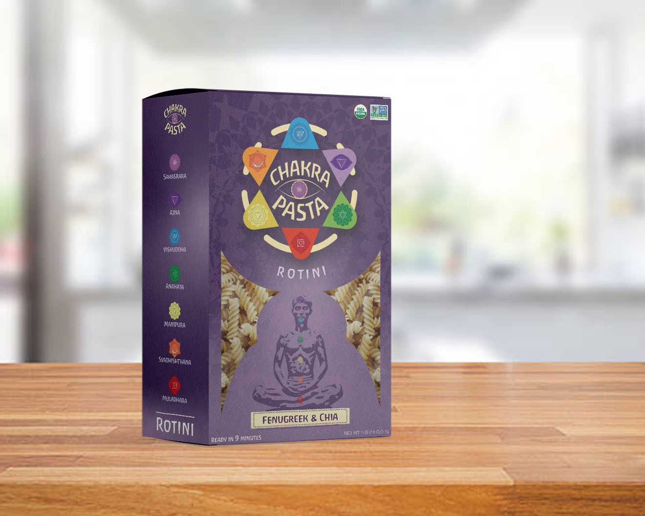
I am also pleased to announce that the wonderful folks at DesignRush found appreciation in this piece. DesignRush is an excellent source for discovering great work from information technology and graphic design service providers. DesignRush not only showcases great work, but they can even help in connecting you to top-tier service providers in these fields.
DesignRush has chosen to feature this design in their 2024 list of The Best Retail Packaging Designs! You can click this link here to read the article.
When you finish reading the article, I recommend you browse through some of the outstanding projects DesignRush has discovered in their findings. DesignRush, if you see this, I want you to know we’re all grateful for the information you share!
